My tasks

As a UX design intern, I was responsible for designing the login page, user profile page, and NFT detail page for a Web 3.0 startup(Panini Club) specializing in consumer electronics. The key objective of these designs is to build trust and connection with users, encouraging them to engage with their NFT collections and redeem rewards. Through thoughtful and user-friendly interfaces, we aim to create an immersive experience that enhances user loyalty and satisfaction.
PaniniClub seeks a visually stunning website design that captivates visitors from the moment they land on the site. The use of vibrant colors and engaging typography can further enhance the overall appeal and make the website visually memorable.
PaniniClub aims to create an interactive website that encourages active user engagement. Incorporating interactive visuals, animations, and multimedia content may be used to further enhance user engagement and make the website a dynamic and immersive platform.
The website should prioritize ease of use and seamless navigation. PaniniClub wants visitors to effortlessly find the information they are seeking. Clear and intuitive menu structures, well-organized content sections, and intuitive icons or buttons should be implemented to guide users and ensure a smooth browsing experience.
Attractive
Interactive
Intuitive
Clients Demands
Project Overview
Project Timeline
Timeline
Jan - Mar 2023
My Role
UX Design Intern
Team
Coco Li (UX Design)
Hunter Zhang (PM)
Scope
Website Design
UX Design
Tools
Figma
Adobe Illustrator

WEEK 1-2
|
WEEK 3-4
|
WEEK 5-6
|
WEEK 7-8
|
WEEK 9
Aproject Factory
A design consulting firm based in Dallas, Texas.
Aproject Factory offers comprehensive design and consulting services to companies across various industries, primarily specializing in Web 3.0 and Industrial 4.0 domains.
Intern Company
Project Background
Client Company
Panini Club
A Web3 consumer electronics brand aims to build a sustainable co-benefit relationship between Creators & Fans. The brand's mission is to revolutionize the conventional Brand-Customer dynamic by Web3 technology.
Aproject Factory
A design consulting firm based in Dallas, Texas.
Aproject Factory offers comprehensive design and consulting services to companies across various industries, primarily specializing in Web 3.0 and Industrial 4.0 domains.
My tasks

As a UX design intern, I was responsible for designing the login page, user profile page, and NFT detail page for a Web 3.0 startup(Panini Club) specializing in consumer electronics, which is end to end project. The key objective of these designs is to build trust and connection with users, encouraging them to engage with their NFT collections and redeem rewards. Through thoughtful and user-friendly interfaces, we aim to create an immersive experience that enhances user loyalty and satisfaction.
Project Overview

Intern Company
Project Background

Client Company
Panini Club
A Web3 consumer electronics brand aims to build a sustainable co-benefit relationship between Creators & Fans. The brand's mission is to revolutionize the conventional Brand-Customer dynamic by Web3 technology.
PaniniClub seeks a visually stunning website design that captivates visitors from the moment they land on the site. The use of vibrant colors and engaging typography can further enhance the overall appeal and make the website visually memorable.
PaniniClub aims to create an interactive website that encourages active user engagement. Incorporating interactive visuals, animations, and multimedia content may be used to further enhance user engagement and make the website a dynamic and immersive platform.
The website should prioritize ease of use and seamless navigation. PaniniClub wants visitors to effortlessly find the information they are seeking. Clear and intuitive menu structures, well-organized content sections, and intuitive icons or buttons should be implemented to guide users and ensure a smooth browsing experience.
Attractive
Interactive
Intuitive
Clients Demands

Project Timeline
Aproject Factory
A design consulting firm based in Dallas, Texas.
Aproject Factory offers comprehensive design and consulting services to companies across various industries, primarily specializing in Web 3.0 and Industrial 4.0 domains.

Intern Company
Project Background

Client Company
Panini Club
A Web3 consumer electronics brand aims to build a sustainable co-benefit relationship between Creators & Fans. The brand's mission is to revolutionize the conventional Brand-Customer dynamic by Web3 technology.
Problem Statement
Panini Club has a unique feature: supporter reward mechanism with NFTs. They share success with their supporters. Through the NFT loyalty program, Panini Club promises a $10 incentive for every $100 in product sales of their physical products as a way to reward the support and love of their fans.
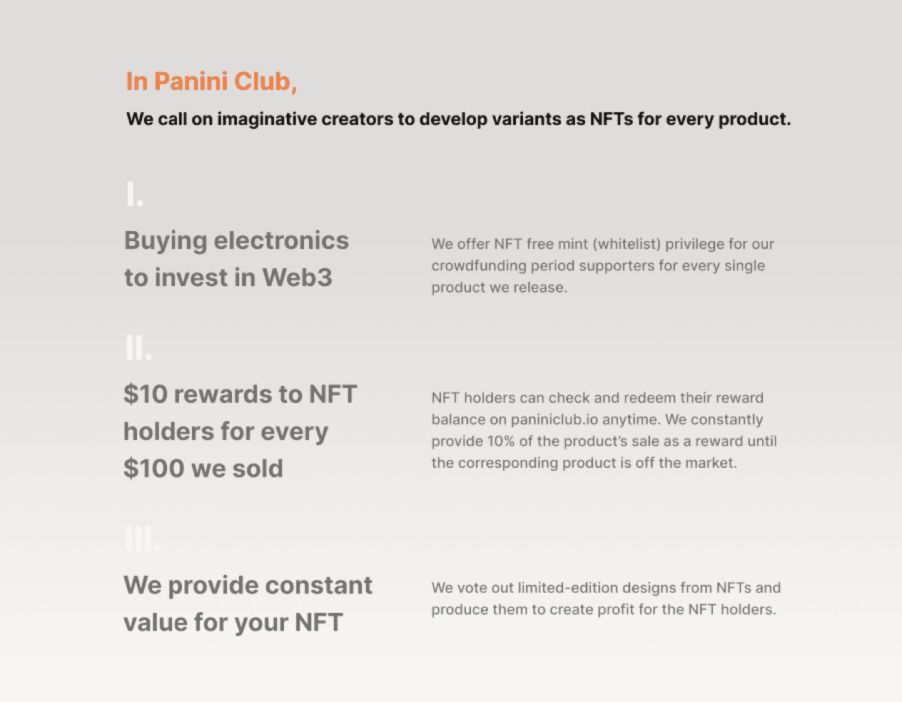
After our research, we found that the uniqueness of the Panini Club lies in its supporter reward mechanism with NFTs, but it is difficult to intuitively demonstrate this to users.
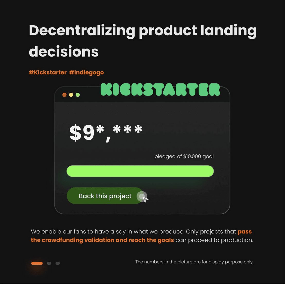
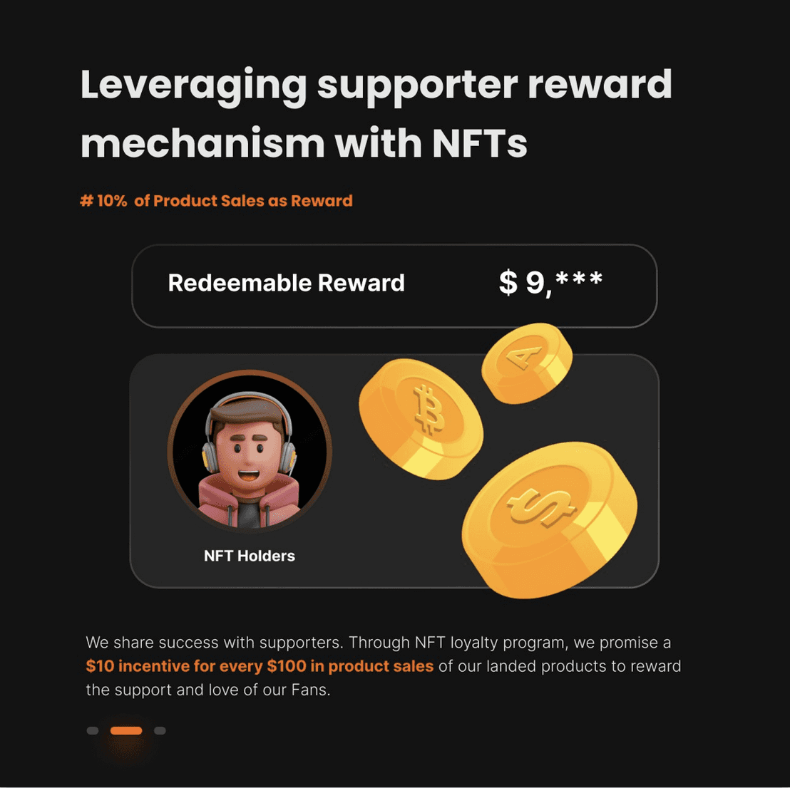
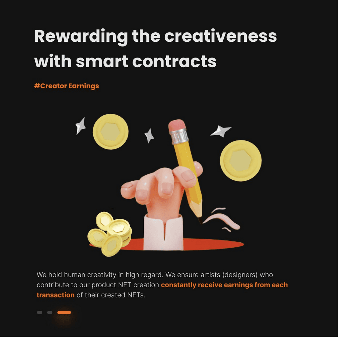
How might we provide clear Profile and NFT Details pages for Panini Club users so they can intuitively understand the profit situation of their NFT Rewards?
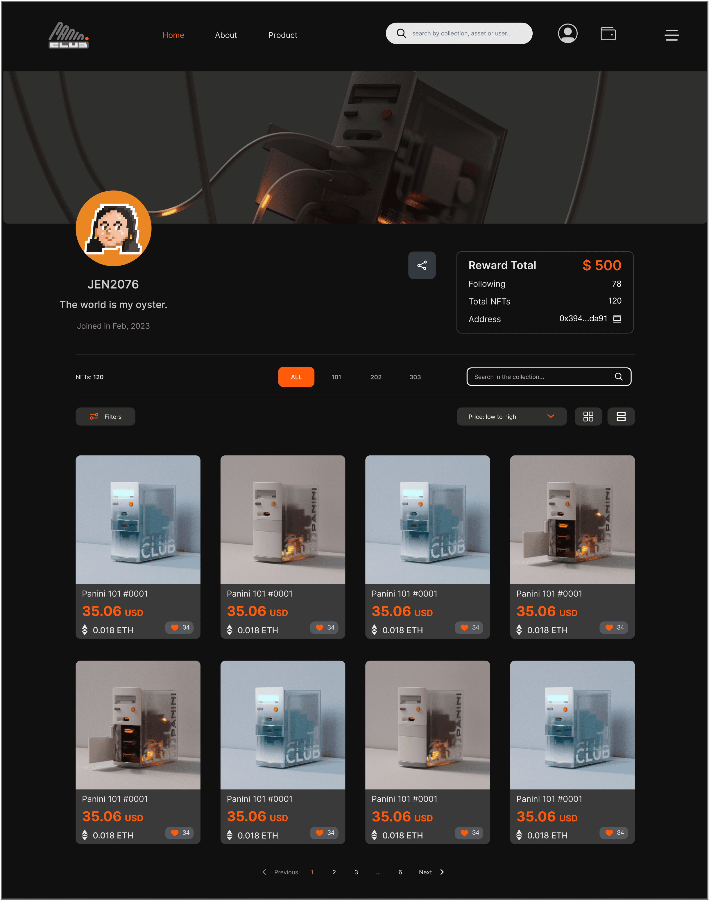
To incentivize early sign-ups and user engagement, I have included the join date prominently in the user info section. Additionally, in the account information card, I have emphasized the total rewards accumulated for the account.
In response to customer feedback indicating the launch of multiple product series, horizontal switching tabs have been implemented to facilitate easy navigation between these different series. This design feature enables users to seamlessly explore and manage the NFT collections they hold across various product categories. By providing clear and intuitive navigation, users can quickly switch between different series, enhancing their overall experience and making it more convenient to engage with their desired products.
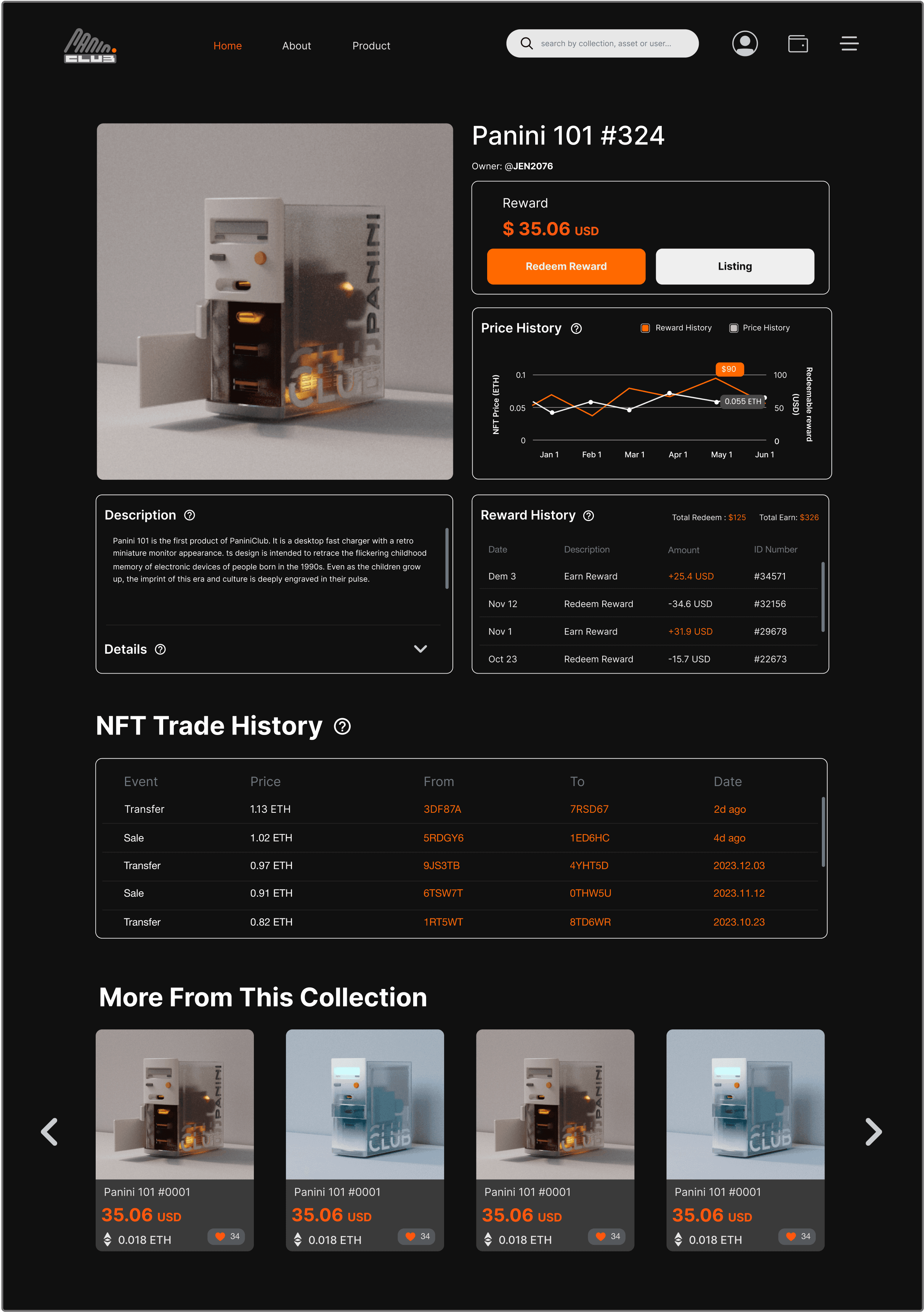
Leveraging user-focused design principles, your NFT Detail page efficiently organizes key information with intuitive placement and informative data visualization. The layout prioritizes user-friendly exploration of the NFT, highlighting immediate visual appreciation, quick access to critical ownership and value details, and comprehensive view of historical data. This design empowers users with a seamless navigation experience, promoting informed decision-making and enhancing overall user engagement with the NFT content.
Initially in our project, we had considered showcasing the price history separately, as illustrated in the initial wireframes. However, recognizing the significant impact of the NFT reward mechanism on price trends within this series, we opted to amalgamate the two data sets (Reward History & Price History) into a unified presentation.
· Encouraging Early Sign-Ups
· Fostering User Engagement
· Visual Cues for Account Value
· Gamification and Motivation
· Enhanced Navigation
· Efficient Product NFT Management
· Improved User Experience
· Convenient Access to Desired NFT Card and Reward.
· Visual Hierarchy
· Ease of Navigation
· Informed Decision Making
The inclusion of price history and reward history in one chart helps users understand the NFT's performance over time, which can be critical to potentially maintaining the NFT owner's continued ownership of the NFT.
· Adherence to Standard Practices
· Comprehensive Understanding
· Correlation Analysis

Final Design
Profile Page
NFT Inventory Page
NFT Detail Page
Price & Reward History Tracker
Inspiration | Getting prepared in Web3
Opensea Profile Page study
Header
User Info
Personal Collection
NFT Collections
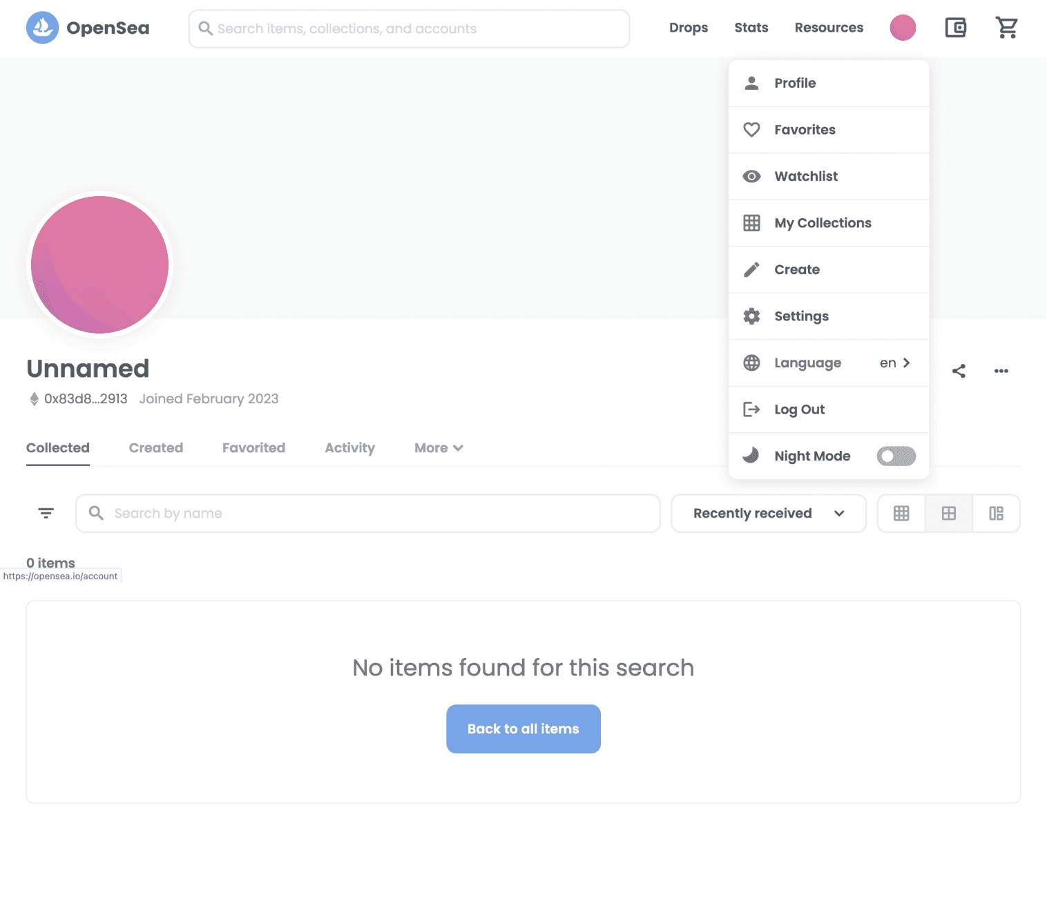


Prior to creating a low-fidelity wireframe, I engaged in multiple discussions with my manager to ensure that my comprehension aligned with the business objectives. The client's company is a Web 3.0 start-up, which implies that there were not too many pre-existing design examples to draw inspiration from. To acquaint myself with website design, I extensively researched and sketched various marketplace websites such as OpenSea, Rarible and Farfetch.
What I learned from Opeasea:
Gain insights into layout and functionality for a successful Web 3.0 marketplace.
Organize and present digital assets or products effectively.
Develop user profiles, authentication, and account management features.
Design visually appealing aesthetics and typography.
Logo, search bar, profile image, username
Username, wallet address, join date, banner
Label, filter, search bar, view options
NFT cards grid/list

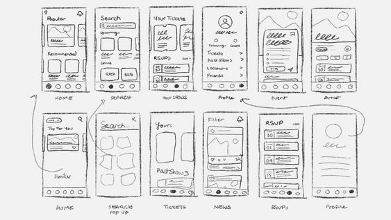
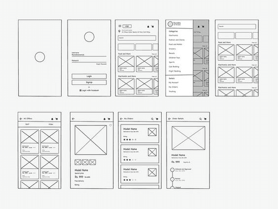
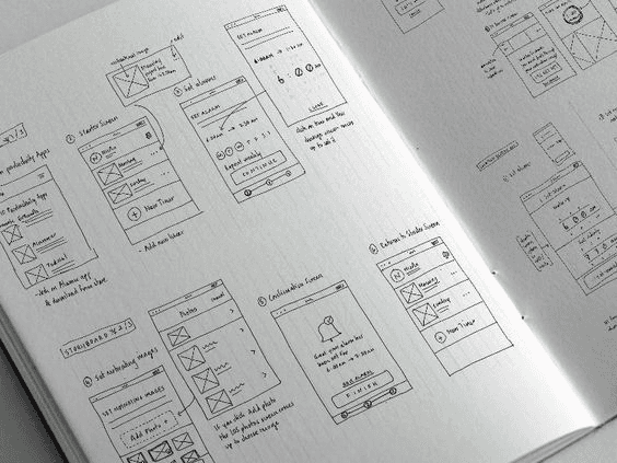
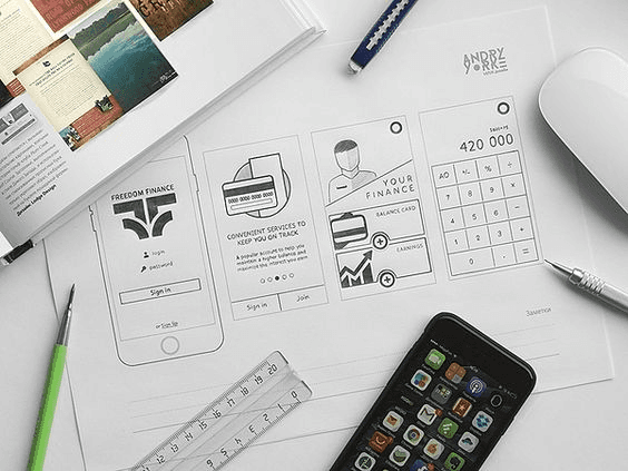
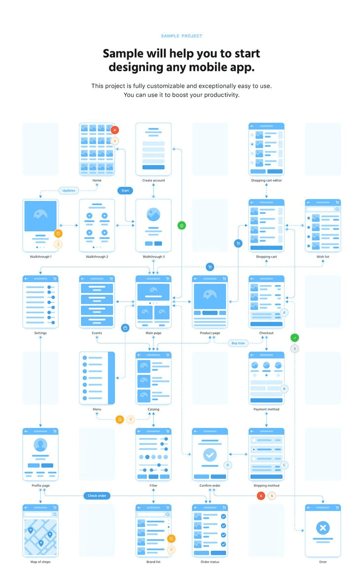
Initial Ideation Sketch
Ideation | Wireframe
Profile Page
NFT Detail Page
Pros:
· The two-column layout simultaneously highlight the profile section and the content section.
· The important redeem reward section at the upper left section can be viewed clearer than design 2.
Cons:
· Fewer NFT cards can be displayed.
· Account information is low on the page and is not emphasized.
Pros:
· User and account info takes a prominent place, emphasizing their importance even more.
· A row of 4 NFT cards is more visually comfortable while displaying more content.
Cons:
· User/account info is not displayed in full after scrolling up.
Direction 2
NFT Section
Collection Name
Account info
Logo & Navigation bar
User info
4-column
NFT Section
Collection Name
User info
Account info
Logo & Navigation bar
3-column
Direction 1
Client’s Feedback
· Fold detailed information about the NFT, such as title, artist, edition, description, rarity, and unique attributes, providing a comprehensive overview of its features and distinguishing characteristics.
· Include a visually appealing carousel showcasing other NFTs from the same series, allowing users to explore related artworks and potentially increasing engagement.
Description &
Meta Data
NFT Image
Reward History
NFT info &
Reward redeem button
Redeemed record
Trade History
Initial Iterations
Search in the collection...
Filters
Price: low to high
Address
Reward Total
Following
Total NFTs
0x394...da91
$ 500
78
120
My NFT Collection
Previous
1
2
3
...
6
Next
101
202
303
Activity
More
Panini 101 #0001
35.06 USD
0.018 ETH
34
Panini 101 #0001
35.06 USD
0.018 ETH
34
Panini 101 #0001
35.06 USD
0.018 ETH
34
Panini 101 #0001
35.06 USD
0.018 ETH
34
Panini 101 #0001
35.06 USD
0.018 ETH
34
Panini 101 #0001
35.06 USD
0.018 ETH
34
Panini 101 #0001
35.06 USD
0.018 ETH
34
Panini 101 #0001
35.06 USD
0.018 ETH
34
NFTs: 120
ALL
101
202
303
60px
60px
60px
60px
1440px
24px
150px
60px
150px
Reason:
· The decision to adopt the top and bottom structure for user personal pages may have been driven by factors such as improved visual hierarchy, better organization of content, or enhanced usability.
· The addition of series switching tabs showcases a consideration for users who may have multiple series of NFTs, allowing for easier navigation and exploration of different collections.
· Refining the information logic on the page demonstrates a commitment to clarity and coherence, ensuring that users can easily find and understand the information they need.
Overall, the changes made indicate a proactive approach to improving the user experience, addressing client feedback, and striving for a more user-friendly and intuitive design.
To ensure optimal viewing across different screens, we have set the standard page width to 1440px. Taking this into account, I have meticulously specified the page elements down to the pixel level for precise design implementation. This approach guarantees consistency and adaptability across various devices and resolutions.
What I’ve upgraded:
· Based on customer feedback and evaluation of two previous wireframe versions, the top and bottom structure for user personal pages was selected.
· Specific information provided by the client, including series switching tabs and account-specific display details, was incorporated.
· The chosen structure allows for refined information logic and improved user experience.
Design-Developer Sync
Dev:
Dimensions: What are the exact dimensions of the banner image?
Format and Quality: What file format should the image be in? JPEG, PNG, SVG, or something else?
Dev:
What the content after clicking the share icon?
Design:
Dimensions: 1440 x 380 px
Format and Quality: Support Jpeg and PNG format file only.
Design:
Start the flow of reward redemption. For now, the client only need us to link it to the user’s paypal account.
Design:
The corresponding reward history and price history data for the month that the mouse is moved over will appear at the same time.
Design:
Max 1500 characters.
Design:
40px
Design:
7 days
Design:
4-12 and only in multiples of 4. If there are less than 4 then the left and right arrows are hidden.
Design:
After selecting the icon, the user will have the ability to share their total reward number on social media. Currently, however, clicking the icon simply copies the website link.
Design:
Price: low to high
Price: high to low
Reward: low to high
Reward: high to low
Rareness
Received time
Design:
Desktop: Above 1200px, 4 columns
Tablet (landscape): 1024px to 1199px, 3 columns
Tablet (portrait): 768px to 1023px, 2 columns
Mobile (landscape): 480px to 767px, 2 columns
Mobile (portrait): 320px to 479px, 1 column
Dev:
What happens if I click “redeem reward”
Dev:
What happens when I hovering my mouse on the price history chart?
Dev:
What will be included in the sort by dropdown?
Dev:
What’s the character limitation for the description?
Dev:
What is the maximum number of cards that can be on this carousel?
Dev:
At what point do the cards adjust to fewer columns?
Dev:
What is the row height in the table?
Dev:
How many days after an event has passed does it show the exact date?
UI Kit
Inter
Light
Regular
Medium
Semi Bold
Bold
Heading 1
Heading 2
Heading 3
Body
Body Small
40pt
24pt
20pt
20pt
12pt
Typography
Color Palette
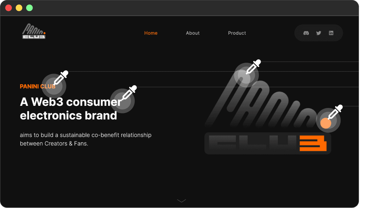
Under the guidance of my design mentor, I incorporated the foundational design elements of the client's webpage into the existing initial draft of the homepage. This integration was aimed at aligning the design with the client's vision, resulting in a seamless and visually appealing user interface.
#FF6900
#E1DDD1
#E7E7E7
#727272
#101010
100%
80%
60%
40%
20%
Visual Language - Using familiar visual elements and making information transparent would help strengthen users’ trust and affinity.
Grid system - Using grid system allows designers to make sure the margin are consistent, and it also make the design clearer for front-end team when they are developing the website.
Business goals - Working with clients, designer needs to also advocate for the business goals of the company. While presenting to the clients, designer needs address the business goal and the solutions.
What I’ve Learned
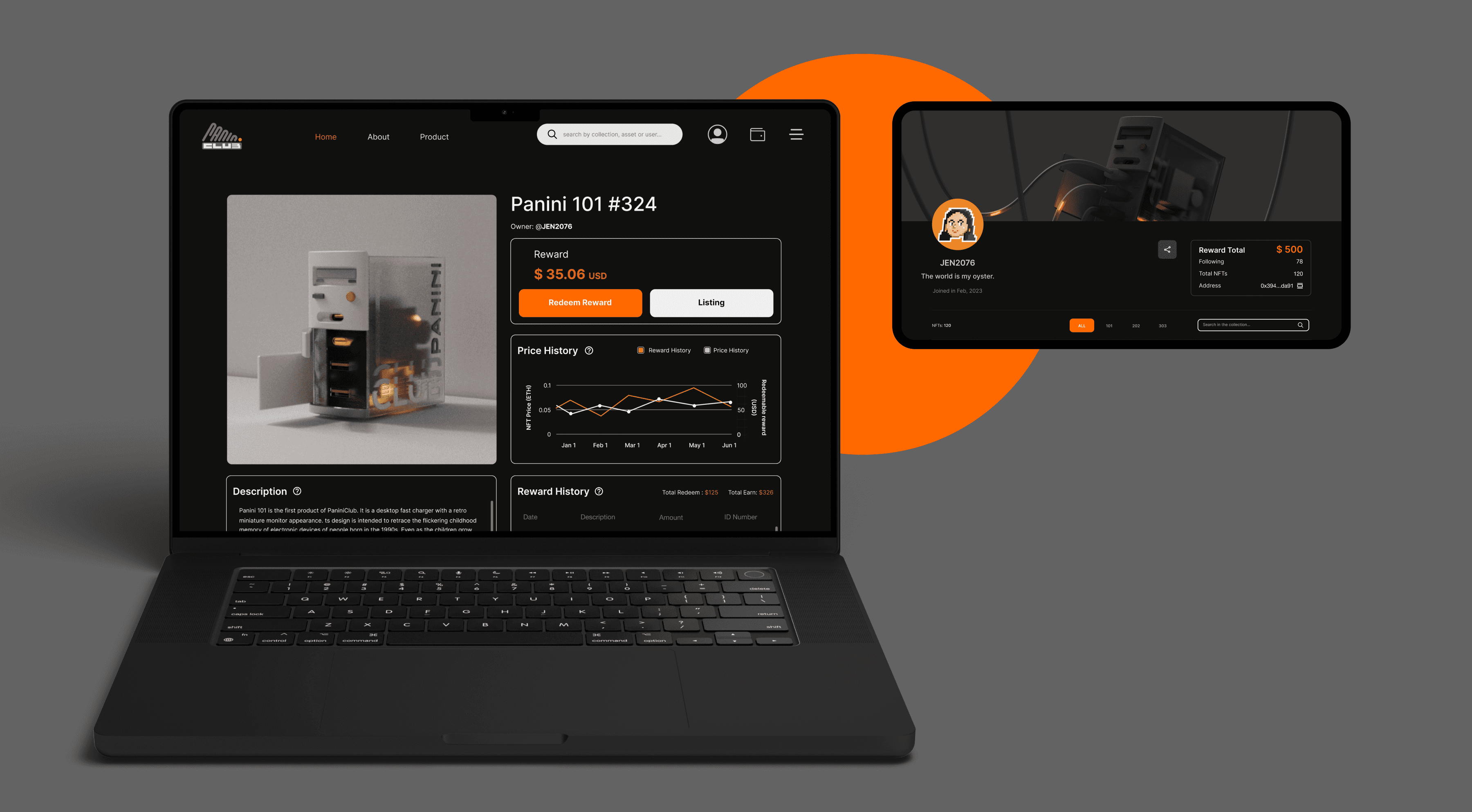
Winter 2023 UX Design Intern Project
Profile & NFT Detail Page Design
for Panini Club
During my two-month UX Design Internship at a Web 3.0 startup, Panini Club, I designed the login, user profile, and NFT detail pages. These designs aimed to foster user trust, promote engagement with NFT collections, and enhance reward redemption. With a meticulous and user-friendly interface, we aimed to boost user loyalty and satisfaction.
#web design
#9-week intern
#Figma