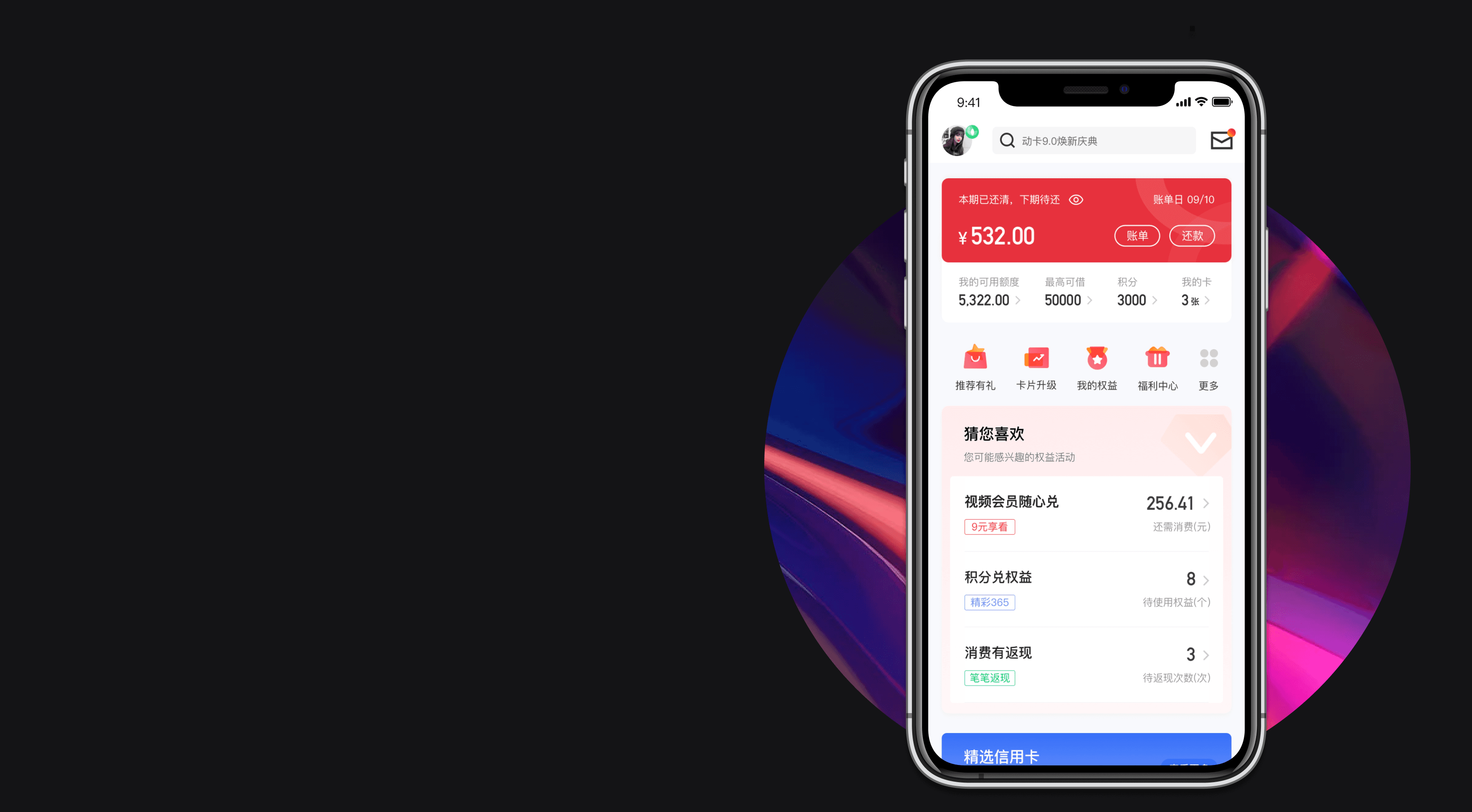
During the 6 weeks working as a UX freelancer at China Citic Bank, I participated redesign the Dong Ka Kong Jian app, study the design styles and trends of current similar products, and propose your own optimization ideas. At the same time, break away from the serious homogenization problem in visual design and user experience that this app shares with similar products on the market.
#6-week freelance project
#Mobile design
#Figma
Dong Ka Kong Jian App Redesign
Credit Card
APP REdesign
动卡空间移动端改版设计

Bank App UX & UI Design
for China Citic Bank

The China Citic Bank credit card's official app provides you with bank-level security, professionalism, intelligence, and convenience for credit card services, installment shopping, cash installments, and financial management services.
Client Company
动卡空间 Dong Ka Kong Jian
China Citic Bank
Timeline
Jun - Aug 2022
My Role
UX Design Freelance
Clent
Scope
UX Design
UI Design
Tools
Figma
Sketch
Project Background
项目背景

Intern Company
中信银行 China Citic Bank
Established in 1987 and is one of the earliest emerging commercial banks to be founded during China's reform and opening-up. It is also the first commercial bank in China to participate in both domestic and international financial market financing.
Project Goal
项目目标
This redesign aims to deconstruct this APP and study the current design styles and trends of similar products. The designer proposes their own optimization ideas, not only from a design perspective but also from a more comprehensive perspective. The goal is to break the serious problem of homogenization in visual design and functional experience that exists in similar products on the market, and to provide a fresh approach for Ka Dong Kong Jian.
对视觉/交互进行分析
Analyze Visual/Interactive Elements
Competitor Analysis
竞品分析
Jingdong Finance (Indirect Competitor)
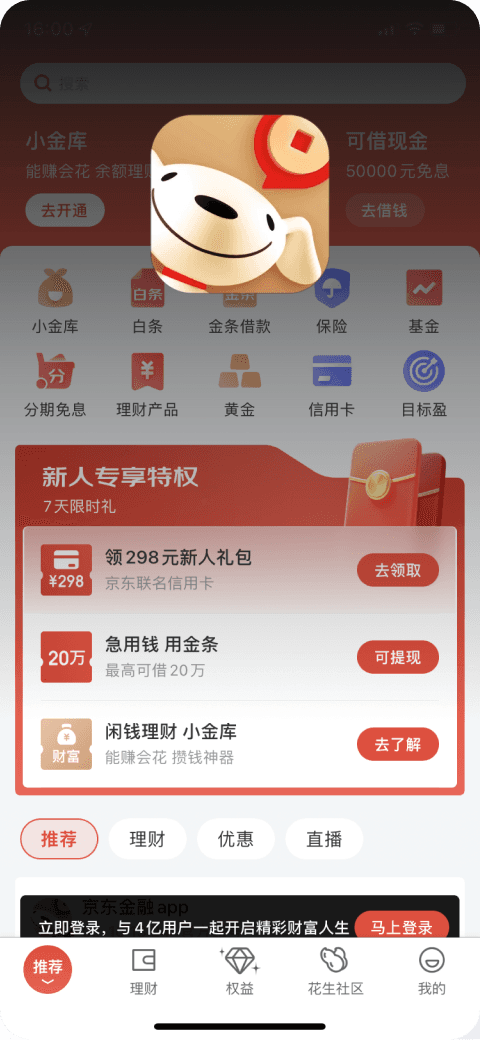
JD Finance, with its core capabilities of intelligence and content, collaborates with financial institutions such as banks, insurance companies, and fund management companies to provide professional and secure personal financial services to users.
Pudong Development Bank (Indirect Competitor)
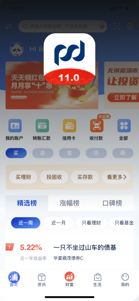
Shanghai Pudong Development Bank integrates many practical functions such as mobile banking, SPD Express (news and updates), bank branch locator, management of co-branded mobile cards, movie ticket purchase, credit card mall, mobile shopping mall, and flight booking.
China Merchants Bank (Direct Competitor)
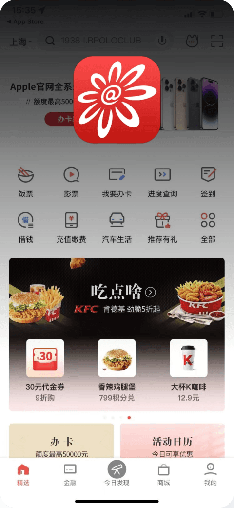
The Pocket Life App is produced by the official credit card department of China Merchants Bank. It is a service platform that integrates life, consumption, and finance.
Analyzing the visual performance layer of direct competitors, including experiential operations, color schemes, layouts, typography, and emotional design; Analyzing the interaction experience layer, including interface design, interaction framework, operation process, label design, and so on, effectively helps to determine design direction and establish standards, and avoid common problems.
The overall layout/formatting/ structure are highly consistent
Visual
视觉
Interaction
交互
Experience
体验
重设目的
Purpose of the Redesign


Design Process
设计流程
Focus on product advantages: highlight the core features and emphasize the advantages over other platforms.
Scenario-based thinking: Create a user experience map from the perspective of a specific user group, recording the entire process of their experience with the product from start to finish, including touch-points, behaviors, pain points, and thoughts.
Efficiency First: Optimize the workflow for users to access core functions and improve efficiency. A good product should follow the design principle of "use it and go."
Information Experience: 1. Add high-quality features that can support rich business and functionality to meet user needs. 2. Manage the weight of information and display key information in prominent locations.
Enhance brand awareness: Incorporating brand colors can establish brand recognition, while rounded corners, consistent colors, style, and unified icons make the design more brand-oriented.
Clear and concise: Design a clear user interface that is easy for users to use
After analyzing Ka Dong Kong Jian, it can be concluded that due to the visual defects of the old version's functions, the interaction logic is relatively chaotic, important functions are not highlighted, and it is difficult to uniformly improve the user experience. Users find it difficult to use the core functions, resulting in a decrease in user stickiness, which does not meet their expectations.
Product Dimension 产品纬度
Experience Dimension 体验维度
Design Dimension 设计维度
Problem Clustering
问题聚拢
Unclear Architecture
Information has no Hierarchy
视觉
visual
Unable to meet the basic needs of users.
Missing Functional Content
Cognition-Enhance Reach
认知-提升触达
Efficiency Comes First
高效-效率为先
Attract-Reinforce Feature
吸引-强化特色
visual upgrade
视觉升级
Optimize the product's functional architecture.
体验
experience
Establish a unified visual language to reshape product perception.
The overall design style of the interface and icons is outdated.
The chaotic display of homepage content makes it difficult to generate a desire to apply for a card.
The code architecture is outdated, resulting in high development and maintenance costs.
Optimize interface hierarchy, reduce information noise, modularize components.
Pay attention to scalability, and improve production and research efficiency.
Not conducive to users establishing basic cognition.
The functional components are too chaotic.
Prioritize content optimization (cognition - improve reachability).
Reduce the operational path (efficiency - prioritizing efficiency).
Prototype Upgrade
框架升级
The core principle of this framework upgrade is to integrate scattered functions and operation modules to make it easier for users to understand them as a whole. At the same time, the hierarchy of modules has a clear boundary and strength, making it easier for users to understand the functionality.
此次框架升级的核心原则就是化零为整,将分散的功能和运营模块进行整合,方便用户更好的理解功能,同时模块的层级也有一个明确的分界线和强弱度。
Hign 强
Low 弱
Business Module
业务模块
Most Frequently Used
Core Features (Diamond Zone)
核心功能(金刚区)
Highlight Display
You may also like
猜您喜欢
Convenient Operation
Selected Credit Cards
精选信用卡
Operational Promotion
Business Area
业务区域
Recommended Area
推荐区域
Integration
整合
Optimization
优化

Principles of Organization
组织原则
Layering 叠层
Top layer of dynamic functionality
Base Layer 基础层
Top and left navigation modules
Returning to the fundamental layout framework design, the functional points are decomposed and redivided into four layers: background layer, content layer, base layer, and overlay layer.
回归根本的布局框架设计,将功能点分解后重新划分成祖,分为背景层、内容层、基础层、叠层四大层。
Content Layer 内容层
Main Content Module
Background Layer 背景层
Background Layer
Icon Design
图标设计
32px
32px
When the parameter is centered but the visual effect is not centered, the visual centering effect should be considered.
2、Visual Balance of Weight 视觉重心平衡
Keep the icons visually consistent in size relative to each other, rather than consistent in numerical size.
3、Visual Consistency 视觉性统一
a. The size of the design canvas for functional icons is 32px * 32px.
b. There is a bleed line of about 2px on the canvas, and the icon has a 2px rounded corner. If the visual effect is not consistent, minor adjustments can be made to ensure visual consistency.
1、Design Guidelines 设计规范
Tab Icon Status Tab图标状态
Other Icons 其他图标
免
Home Page/Profile
首页/用户资料
The Homepage Style is Outdated and the Form and Content are Chaotic
Rounded corners deliver a soft and comfortable feel
Optimize layout and element rules
Gradient levels enhance smooth sensation
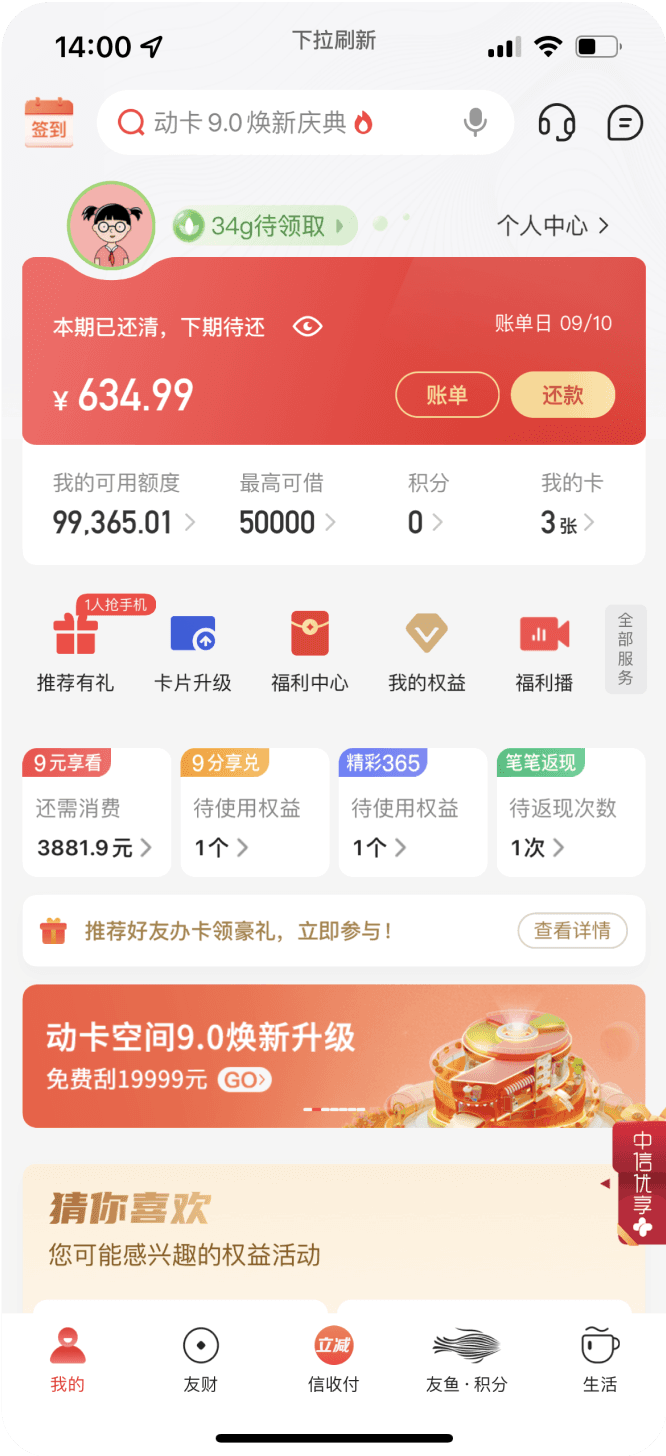

In terms of color application, rich color gradients are used to enhance a smooth feel. In layout, the basic elements of the layout are optimized to follow the 4-multiple ladder rule. The design style uses low-angle rounded corners to convey a sense of softness while increasing the seriousness of banking products.
By using a card-based modular design, it greatly enhances the sense of order on the page and expands the acceptance of the user audience.
Set the global margins and adapt the internal scaling, in order to ensure consistent visual proportions when displayed on other pages and different terminals.
v1.0
v2.0
首页风格老化 形式内容混乱
Card-style modular design
Componentization, improving production and research efficiency
视觉品质感
Visual Quality Sense

Money Management
友财

视觉风格创新 提升层级感
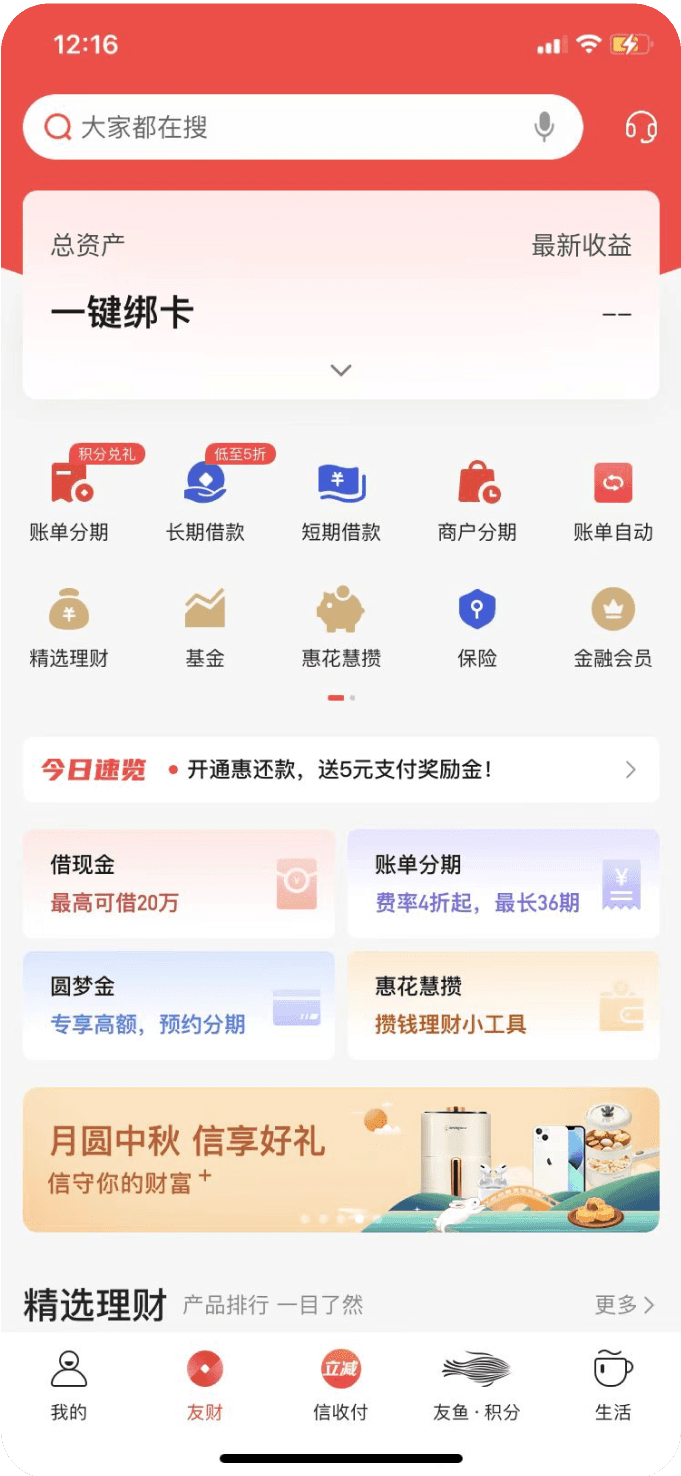
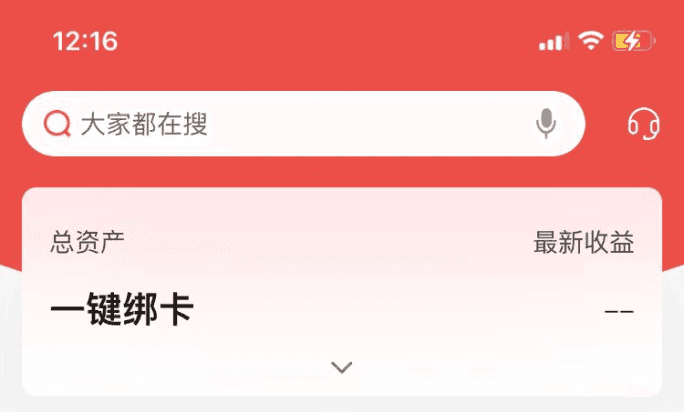
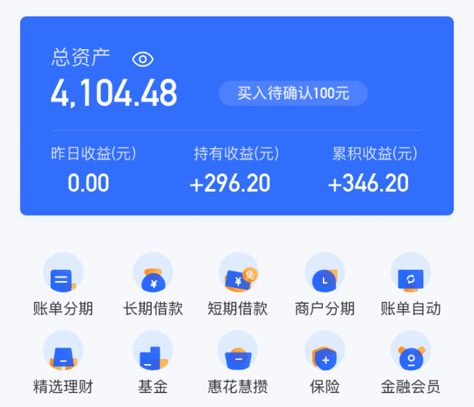
Breaking away from traditional color schemes, products no longer rely on a single color palette for all of their design elements. Instead, colors are chosen based on practical considerations, which can reduce visual fatigue for users, while also enhancing functionality and overall product impression.
Break the fixed color scheme to reduce visual fatigue
In interface design, it is necessary to maintain a visual hierarchy. Therefore, in the new version design, I intentionally lowered the visual weight of each section from top to bottom in order to make users unconsciously perceive the logic of the page while using it.
Visual Hierarchy
2
3
4
1
v1.0
v2.0
01
02
Color matching
Visual style innovation Enhances the sense of hierarchy
配色思路
Presentation Skills - Giving a compelling presentation to clients and ensuring their satisfaction is a challenging task. It requires persuasive speaking, as well as practically addressing the client's problems.
Visual Design- Especially in creating B2C (Business-to-Consumer) products, having beautiful pages is essential. It is necessary to attract users' attention with exquisite visuals.
Collaboration - During the process of creating this project, I deeply realized the importance of teamwork. We need to maintain good collaboration with team members in order to create a complete and attractive project.
What I’ve Learned
User Behavior Analysis
用户行为分析
